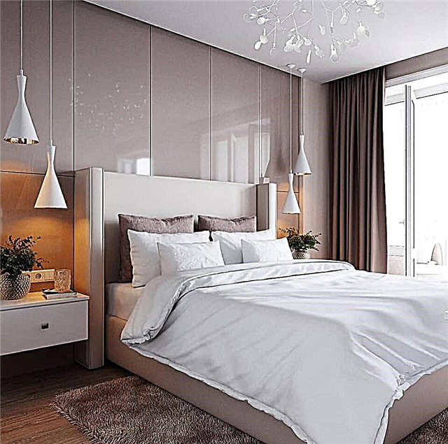
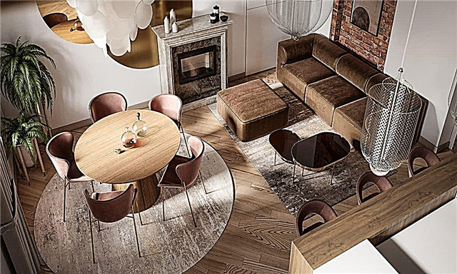
We’ll immediately clarify exactly which style you are interested in:
- Just properly designed, modern
- High tech
- Industrial with loft elements
Here it will be about the high-tech style kitchen, i.e. 2 last. If you need the first, feel free to read any articles on the site they are all about the nuances of just a modern minimalist design, choose which is closer:
I myself am a supporter of hi-tech and minimalism, and I picked up very cool photos here, save ideas.
In real apartments, it makes no sense to go into a fanatic following the canon, but to take the ideology of style is quite.
2 High-tech kitchen designs
Two areas that are fundamentally different in their approach to design, which are completely different, but both can be mistaken for high-tech cuisine:
- Ultra minimalism. Everything is built-in, everything is hidden. Like an iPhone or any cool modern device. Outside heaps of wires, antennas, bulbs and sensors do not stick out. With internal complexity, the exterior design is super simple and minimal.
- Industrial style or loft in a modern variation. Stainless steel, chrome, glass, sophisticated futuristic fixtures and furniture - that's all.
We will analyze both types with an emphasis on the first (in my understanding, this is the real one). In general, read a review article about all interior styles.
High-tech cuisine is expensive. No options.
If someone says the opposite - run. Unlike the classics, which imitates the past, hi-tech imitates the future, but imitating is always not cheap. Try to save, for example, on a radiator or window sill, leaving everything from the builder, and the whole entourage will end.
+ To think through all the joints of materials and furniture for total embeddedness, you need a project. Understanding the campaign is a bad idea. * joke about hi-tak *
Modern minimalism
All that I advise in each article, but in a radical way:
- Built-in kitchen to the ceiling (lower the ceiling in the area of cabinets or the upper row according to the mezzanine principle).
- The complete absence of visible handles on the furniture.
- A refrigerator, an oven, an extractor hood and a microwave are also built-in, it is possible in a pencil case (2 racks under the ceiling nearby).
- The detergent dispenser is embedded in the sink, the mixer with 2 levers for ordinary and drinking water (connected to the reverse osmosis filter under the sink).
- Small appliances: toaster, coffee maker, blender - are also hidden.
- Monochrome. Shades from white to black + wood. There will be a separate point about this further.
With seeming simplicity, it is not easy and cheap to realize, but it also looks expensive. But this is not scary - even if in the end it is not high-tech, it will still be a solid modern kitchen.
Minus is impractical. The interior is gorgeous only in perfect order, which is problematic to maintain. But this is the price of imitation.
Industrial with loft elements
This kind of hi-tech is more likely to be a representation of the future from science fiction films of the past. There is nothing wrong with that, it can look cool too, but there is a risk of getting a collective farm.
Further, I will subjectively divide all the photos into cool and not. Unlike the first version of a minimalistic high-tech kitchen, where even with a bunch of mistakes, the design will turn out to be good, with an deliberately technological style it can turn out right badly.
What are the errors (see photo):
- Frosted or green glass is not good. Standard glass has a green tint, this is especially visible from the end and when illuminated. Only white and transparent are suitable.
- Furniture with a claim, and the usual decoration is a discord.
- Regular cheap items against a technological background lower the entire interior to their level (radiator and wallpaper behind it in the first photo).
In fairness, some kitchens with photos were taken long ago and therefore irrelevant, but this is the danger of such approaches to design.
1. Furniture and layout
- Right angles only. There are hi-tech lovers with radii, but this is an unjustified risk, it almost always turns out disgusting.
- Layouts with an island or bar counter. + It’s more difficult to find a good ordinary table and especially chairs for it than bars to the island or counter.
- In a small kitchen it is also possible, then lean towards angular layouts and even p-shaped ones - you need a lot of closed storage places, otherwise you can’t get them.
- If you use the kitchen a little and do not store supplies, you can make at least 1 wall without upper cabinets. Either way or to the ceiling.
- The set can be made without gaps with the wall and ceiling and without trims. If furniture makers say the opposite, look for others. Naturally, measurements for this are done already on the finish if it has a thickness (tile or decorative plaster).
2. Color
I always say that a white kitchen is the best option and high-tech style is no exception.
It can be made cool and in dark colors, but it is much more complicated.
- White is good in glossy and matte. Dark colors are only matte.
Pure black is dangerous because the result is unpredictable. If you want to add dark, use dark gray (graphite) in a matte finish.
An unusual tree comes in well. Brushed massif (with a developed texture), glossy wood, unusual breeds like walnut. Standard options like chipboard with imitation oak are good for the Scandinavian style, but not for high-tech. Read about the white kitchen with a wooden countertop - sorted out all the nuances of the interiors with wood there.
You can not use accent colors at all and dispense with shades of gray. A bunch of photos from this article prove that it will not be boring. If you do, underestimating is better than overdoing it.
White fridge and microwave only in glass; enameled options will not fit the design. Or stainless steel.
3. Light
Light is beautiful not by the source, but by the manifestation of the texture of the illuminated surfaces.
The best choice for a high-tech kitchen is hidden lighting. Fortunately, the choice and quality of LED strips is now on par.
- The backlight of the apron is underestimated and left to the kitcheners. As a result, the power button is on the headset. And this is the most important part of lighting a kitchen. We make the wiring and put it on the switch at the entrance like the rest of the light.
- Highlight the bottom of the kitchen. The photo looks normal, in reality - the guard. Near the headset, the floor is almost always a bit dirty and there is no point in focusing on this. Never highlight the floor.
Ideally highlighting a heterogeneous surface such as concrete or imitation. Then the texture appears in the shadows and it looks gorgeous.
High-tech designer luminaires have the right to life, although not required. But do not go overboard with them.
4. Curtains
Many are baffled by the choice of curtains for a high-tech kitchen. And not in vain, there is a nuance with this: straight blackout curtains are still good, but only in shades of gray.
For other modern styles, it is often well suited, for example, dark blue, but here it is always a risk.
Read about curtains in the kitchen (a lot about short options) and about curtains in the kitchen with a balcony (more about long ones).
5. Decor
A separate high-tech style kitchen decoration is not needed. Accuracy, order and lighting - the basis of design. If you managed to realize everything’s built-in and hide all the jars and other kitchen utensils, most likely the design is already cool and additional decoration is not necessary.
From the non-obvious, which may be an accent:
- Window unit. There are unusual beautiful batteries, which, coupled with a dark-glazed double-glazed window with normal fittings and a non-plastic window sill, will make it so beautiful that you even don’t want to hide it behind curtains.
- Skirting board. Aluminum, painted MDF or even their absence (if the flooring and tiles) immediately transfer the repair to another level. About the choice of flooring in the kitchen and joints.
- Table, chairs, faucets - there are very futuristic design samples.
Naturally, all this costs money, but I warned.
Hopefully not very intimidated. In extreme cases, take individual elements - in a real apartment, strictly adhering to 1 style is not necessary.
Read my material about the design of a small kitchen - there, on similar modern examples, 7 rules and 4 frequent mistakes are analyzed, but at the same time, given the limited budget.
Why combined?
The main reasons and prerequisites for combining the living room and kitchen areas can be the following features of the living room:
- Small, insufficiently spacious kitchen area. A small kitchen is more or less convenient for one person, but if a family of several people lives in an apartment or house, then in a small room it will simply not turn around.
When demolishing one of the walls and increasing the kitchen space, this problem disappears. In the kitchen-living room space, you can even organize a dining area.
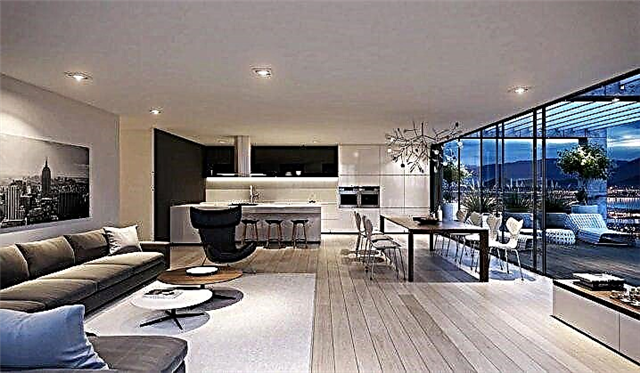
- Large area of the adjacent room. If the apartment has a small living room and kitchen, but the adjoining room has a large area, the solution may be to move the wall and reduce the space of the room. In the room you can equip a comfortable bedroom. And to get more space in the kitchen and living room areas with competent design.
- The increase in the area of the living room. In small-sized apartments, the question of the place of reception of guests is rather acute. A small room often serves as a master bedroom and it is not very convenient to make friends in it. And the area of the hall may be insufficient.
In this case, due to the demolition of the wall between adjacent rooms, you can win additional space.

Advantages and disadvantages
The obvious advantages of combining the living room and kitchen include:
- The effect of visual and functional increase in space. This is especially true for small apartments, where the walls and partitions between the rooms seem to “crush” and “steal” the already precious meters of free space.


- More comfortable and convenient use of two areas of the apartment. If guests come to you or you have a family dinner, it will be much more convenient to serve refreshments, clean dishes and change dishes. After all, food and cutlery will be very close. The hostess does not need to leave the guests to put a kettle on the stove or arrange the pieces of cake on plates.
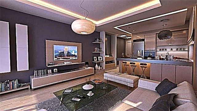
- Cozy interior and savings on electrical appliances and furniture. For a combined room, you can choose an economical type of lighting, because in fact you no longer need to light two separate rooms. In the living room, combined with the kitchen, one TV is enough. Properly selected furniture will also help save money.


- Comfortable and enjoyable meal. When there is very little space in the kitchen, family members have to crowd around at a tiny table, or even have lunch and dinner in turn. Sometimes a more inconvenient option is also possible when you have to leave with plates in the hall or bedroom. It is much more comfortable and sincere to dine together at a table that is large enough.
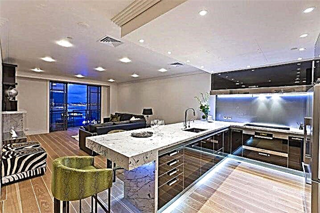
Some consider the following points a drawback:
- Steam from boiling and smells from the cooking process immediately become regulars in the living room. It can be stuffy or hot in the room if the cooking process is long. Humidity can also periodically increase, since most of the quenching or cooking processes are associated with boiling of liquid. And dust and other impurities deposited on furniture are more difficult to clean.
- If the apartment no longer has separate rooms, or not all family members have, then combining the living room with the kitchen can cause some psychological discomfort over time. Since this zone becomes common, it is impossible to be alone with yourself, to be alone for work or reading.


Modern style
The design of the high-tech room is always very catchy and recognizable. This style was born at the end of the 20th century and quickly gained its popularity in the field of interior design of various types of premises. The specificity of this direction in design is shocking, a bold combination of a variety of materials, original color schemes. A characteristic feature is also the rational use of space and furniture.


In the high-tech style there are very few trifles, and the objects are quite large, with clear straight shapes. To design a kitchen in this style, materials such as plastic of various colors, glass, metal are mainly used. Mirror or reflective surfaces are welcome.
The basic rules and principles of designing a high-tech kitchen combined with the living room:
- Adequate room lighting. Bright, detailed lighting prevails in this direction. Often used spot built-in lighting, additional lighting of furniture or decor elements. The color spectrum of the lighting is neutral or cold.

- Geometric space planning. Direct outlines of furniture, a minimum of decorative non-functional additions and details.

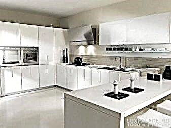
- Bright and saturated colors. Often there is a contrasting, striking combination of colors and shades. Especially effective are the contrasting combinations of bright elements with a white or light background. The second color option is to use one color or 2-3 shades close in spectrum. The working surfaces of the furniture are not occupied with anything. Kitchen appliances, products, cleaning products, personal items are put on shelves, in cabinets or in closed cabinets.
- Rational and convenient placement of furniture and household appliances. This style does not tolerate a heap of things and furniture. The space remains as free as possible due to the arrangement of only the minimum necessary items. For the living room combined with the kitchen, a folding bar counter, folding chairs, and sliding tabletops built into kitchen cabinets are well suited.


An overview of the high-tech kitchen in the next video.
Hi-tech interior color palette
The main companion of the laconic design is restraint, the absence of annoying, knocking out elements.
 The basis of modern design are:
- White - A classic option for hi-tech cuisine.
- Beige - comfortable warm shade, ideal for both the living room and the work area.
- A high-tech living room kitchen design often uses gray and black. As a rule, these are shades of metal - a common material in modern interiors.
- Brown also applicable in this direction, but most often it is a contrasting dark chocolate tone.

The third color is bright, knocking out of the composition may also be present in the setting, but it will be one part or several small ones located at a distance from each other.
High Tech Features
A high-tech kitchen, like a living room with it in a single space, is the embodiment of exceptional technology in a convenient and functional design for a comfortable stay. Technologies simplify many processes, free hands and time, so they are present in such an environment in the maximum quantity.
 High-tech interior is:
- absolute geometricity and simplicity of minimalistic design,
- stylish modern shades in monochrome or contrast use,
- technology - a design element that allows you to hide all the excess behind the facades,
- practical modern materials - glass, concrete, plastic, metal, artificial stone,
- minimum details, lack of decor,
- a lot of light and various lighting systems,
- "Smart home" in its ideal implementation.
 All this is embodied in the absence of textile details, that is, for example, the design of the window should not rush, so there can only be blinds here. Even the sofa is likely to be leather, since such a surface does not look like fabric.
For a hi-tech style room, it is important to choose smooth surfaces: the kitchen is usually equipped with a glossy set, which is most reminiscent of modern equipment facades - with glass and metal elements.
Color schemes
Choosing a high-tech for your kitchen, and even more so for a room combined with a living room, you should consider many details. Of great importance in the composition of this design is the color palette. And these are not just preferred shades - the color creates space here, so its choice becomes one of the most important stages of interior design.
 It is especially important to think over a color scheme for a kitchen of a small area, but a large living room must be organized correctly.
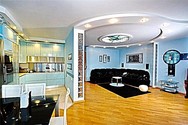 To do this, choose any of the effective techniques:
- Facades of the kitchen set, made in the exact shade with the walls, merge with them and thereby visually free up space. As a rule, white or beige tones are chosen, since dark ones, alas, are not able to visually increase the area. At the same time, storage systems can be built into niches, then they will not occupy the real area.
- Glossy surfaces “push walls” more efficiently.
- The dark finish of the ends and contours of cabinet furniture, a dining table, a TV niche and other functional structures give the space an extra volume.
- The “metal” kitchen looks luxurious with a large bright accent in the living room - for example, a red leather sofa.
- Large space can, on the contrary, be filled with dark furniture. The headset will look spectacular at the full height of the wall of the working area. Then there is no need to look for suitable finishing materials for the kitchen.

Any color combination or monochrome interior can be supplemented with original lighting systems. Simple tricks will make the kitchen a high-tech living room futuristic.
Furniture for a modern kitchen with a living room
The minimalistic simplicity of this style is embodied in the clarity and geometricity of furniture.
 Smooth, monophonic surfaces are present in all functional areas, but they are realized, of course, in different ways:
- The kitchen set for the high-tech kitchen-living room always has solid facades, preferably without any handles and additional accessories. Modern opening systems allow you to control the doors without any effort.
- Instead of cabinets in the working area, you can use niches, incorporate “smart” storage systems into them and close them not with facades, but use furniture blinds in steel, white or beige - under the basic shades of surfaces in the composition.
- Since household appliances must be built in, furniture includes many niches for appliances. Small devices are placed on the shelves of pencil cases, they reliably hide all unnecessary from the eyes.
- The headset looks solid and single - perfectly tailored to the parameters of the room. The unity of furniture and appliances is complemented by a countertop with a moisture-resistant base - a practical, functional, wear-resistant surface.
 Facades can be made of any material, but the requirements for their practicality and design should be taken into account. That is why in hi-tech kitchens, MDF doors coated with enamel or acrylic, as well as steel surfaces with special fingerprint protection, are appropriate.
 Furniture for these areas of space is fully consistent with the style and its requirements. Everything here is also simple and geometric. A high-tech dining group is usually represented by a simple table (possibly a glass), as well as anatomical chairs, which can be plastic.
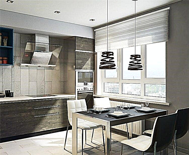 The gloss, which is especially appropriate in such an interior, has both modern appliances and a built-in kitchen, so it should be present in the living area. It uses a minimum of furniture - sofa, armchairs, TV. If there is a need for places for storing things, then they should be the same as in the kitchen - built-in, merged with the walls, smooth and invisible.

Finishing and materials
For large or small high-tech kitchens, only practical materials are chosen. There are no short-lived artificial substitutes, paper wallpaper and textile details. Stone, glass, metal, plastic are the main coatings, but where they are not so appropriate, paint or plaster is used.

- Walls are usually painted, but in a hi-tech style kitchen they may not be visible: since the kitchen set will be smooth, one-color, the same will be vertical surfaces. At least one partition will not be here, as the room is combined with the living room, and another one will be replaced by French windows. If the windows are installed ordinary, the space around them can be arranged in the same way as the headsets - cabinets built-in or hidden behind the glossy facades. The glossy surface reflects light better, therefore it is such doors that are best used in small rooms.
- Since the ceiling masks communications, it is usually done suspended - suspended or plasterboard. Here you can use multi-level designs with or without backlight. The color of the surface varies, and in high-tech style, chocolate and black inserts are applicable to give the whole space depth.
- The floor should be comfortable, but today “cold" materials can be supplemented with heating systems. Therefore, in a modern kitchen, and even more so in the decoration of a living room, stone tiles, practical ceramics, and high-quality wood are used. A practical solution would be a bulk floor - as glossy and technologically advanced as anything else. The original option is a 3D coating, which is used as a decor.

Lighting: fixtures for a modern room in hi-tech style
High-tech room lighting is a technological, simple and functional system. Chandeliers cannot be decorative: they are geometric, concise and fully fit into the color scheme of the interior.
 In such a kitchen and living room, it is necessary to organize several systems: good hi-tech lighting implies different scenarios and moods. Therefore, there are always additional light sources:
- Throughout the room you can see the mortise and overhead lamps, built-in and hidden lamps, spotlights, wall and ceiling.
- The backlight transforms the white kitchen, adds mystery to the dark composition, makes any furniture weightless.
- Highlighting the ceiling, niches, built-in structures - this is the opportunity to create an intimate atmosphere or a fantastic atmosphere for a party.
 The combination of gloss, lighting and simple geometry makes the room as clear and technological as possible - completely in the spirit of modernity.
Designer's recommendations
- Do not get carried away just polished surfaces.
- To bring a “touch” of adjacent styles (art house, underground, minimalism of Japan, elements of pop art, postmodern motifs).
- To comprehend the “space” of the hi-tech style with something from the nostalgia of astronauts who brought along reminders of the house: a living corner, a rarity from the flea market, a cut of a tree instead of a countertop, a floor clock without ringing, etc.

The art of harmony
The brilliance of metal emphasizes (softens at the same time) the presence of deep to black blue, frank scarlet, velvety white, luminous yellow - as on the “windows” of the artist Mondrian. The division of sections can be arbitrary, as on the classics of the playground or on the Renaissance stained glass window. Aluminum and stainless steel play the role of framing. Copper will come to the golden, burgundy. The awkward blotches that are allowed by the loft style can be bizarre in shape, flashy in color. Example: a bright dish “freak” among the monotonous silver kitchen.
The “gap” of the arch to the kitchen looks more spectacular from the living room, if the kitchen is united by the color of the walls and the headset. The expressiveness of the shape of the gap, contrasting with the color and decor of the living room, creates the illusion of a passage under a rock to a landscape with a different climate.
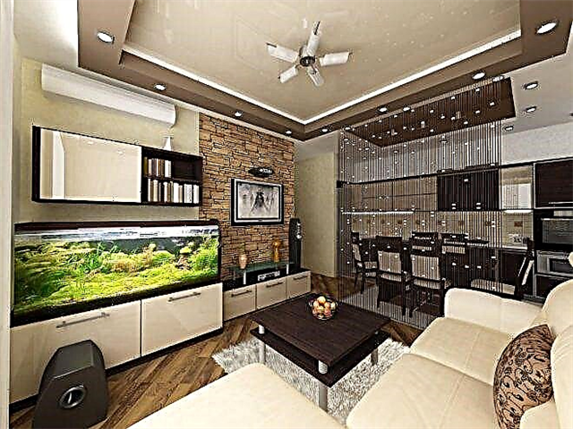
Material invoices
First of all, the texture of the walls is decided. A fundamental factor is the creation of the background for everything else.
A good technique is walls covered with decorative concrete plaster. The metaphor for the fact that the starship landed in the middle of the area after a cataclysm. Against such a light background, the situation should be darker. The furniture is extremely light. Thus, the expressiveness of the silhouettes of furniture is achieved, which is very positive for vision and a sense of comfort.
Visible traces of destruction are obligatory here: molten steel, unpolished welds, embossed plaster to live stone (it is usually laid on top). But a little bit. Filling - shine, gloss, rhythmic corrugation.

Spatiality
Whatever the area - I want to increase it. At least visually. Curves on the ceiling can create cosmic infinity. A slightly retracted hatch plate (plasterboard construction), a multi-tiered porthole with a starry sky (point or contour LEDs), a rocky structure with stalactites are imitated. It becomes unclear where the top, where the bottom, there is a feeling of weightlessness.
On the floor, a combination of glass (for example, on the step of the kitchen podium), linoleum, laminate, parquet board with a wide pattern of spherical, concentric formations is acceptable. The floor is expressive in bulk liquid plastic. If in a rich way, then a silver-plated board is suitable. But if “... the spaceship landed in a forgotten place” - they lay a laminate with the texture of a rough hedge.
The sensation of unsteadiness of attraction will arise from the “creep” of the floor covering onto the walls, the walls creeping down. For example, when the rack flows into the podium under the TV.
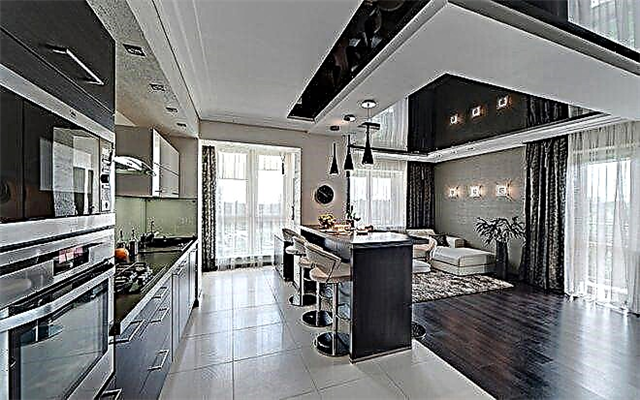
Ergonomics above all
Borrowing design from all sorts of styles has not turned hi-tech into pompous design. High-end furniture - whether it be chairs, ottomans, sofas and tables - without exception is extremely comfortable.
The designs of furniture units are extremely simple, concise, and therefore light, with elegant curved shapes. This is not only a matter of hinges, rollers, stretching cables and aluminum weightlessness. Ergonomists take into account the factor of convenience as much as possible, discarding all decorative excesses. That is why rough textures are desirable in a high-tech interior filled with graphic lines of decor. For balance.
Cabinets - they completely turned into removable walls (wardrobes). The surfaces of mounted cabinets are mirrored, sandblasted, decorated with rattan, they become pseudo-windows with landscapes, they form applications from colored acrylic.

It is impossible to direct open light to many shiny surfaces. Glare is avoided by the small power of the light sources and the rational distribution. The theater chandelier does not blind because it hangs high. High-tech light is calculated prudently, but not sparingly. We are talking about spectacular highlights at night. The white light of energy-saving lamps and ribbon chains of luminous elements is soft. However, it is customary to hide such light sources behind protrusions of ceilings, walls, sometimes among grooves of furniture.
The easiest way to turn into a lamp is a drywall decorative beam or overhanging plate, mounting a group of lamps on it. It is more difficult to take into account the wiring before installing the wardrobe and the delivery of the furniture set. In this case, hi-tech demonstrates its capriciousness: it is necessary to consider in advance where the dining table will be, its size, how the housewife will work in the kitchen, where to sit for reading, where the plants will be planted.
Excess light is cleaned easily: by rheostatic regulators. The disadvantage is made up by floor lamps. The art of calculating subtle directional beams is entrusted to designers with their 3D programs, while electricians more often insure themselves with an extensive network of wiring under false walls.
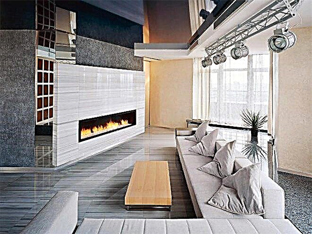
Windows, pseudo-windows
A good reception is when a print with a motive of a night city, rocky mountains, streets or the sea coast is glued between the ledges of the walls. Light is mounted on the slopes of the window. It flows along the frequent folds of a light organza, or, conversely, shines through the rough weave of a baggy curtain. For light effects, hi-tech drapes are preferable to plain, but with an expressive texture. Upholstery of sofas should also not be patterned, but resemble something: stone, steel, the skin of an unprecedented creature.

Accents
Like all living things, the described style absorbs the actual. Factory graffiti and inscriptions reminding you of necessary things on perfectly painted walls appeared on the tiles. Ancient mysterious runes are matted on the glass of sliding wardrobes, stretch ceilings turn into a parade of planets. The main thing is not to overdo it with all this.
Features
In the interior of the kitchen-living room, the high-tech style will emphasize the wonderful taste of the owners of the house, the ability to follow fashion trends, but at the same time maintain their individual outlook on things. Clarity, severity and evenness of shapes, lines, angles and colors are essential components of high-tech style. The main principles are high technology, modernity and relevance, dynamism and originality.
The interior in this style is primarily suitable for avant-garde followers who strive to be at the peak of fashion, keeping up with the times.

Distinctive features:
- clear lines, simple and strict
- built-in structures - drawers, shelves, cabinets, household appliances,
- Elements and parts are made of industrial materials - glass, plastic, metal, concrete,
- wood and stone masquerade as metal

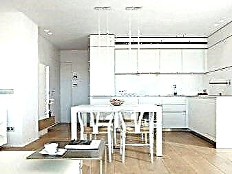
- the complete absence of gilding, elaborate wallpaper, various decorations, excessive decor,
- brick and concrete are not painted, only plaster is allowed,
- the presence of partitions, sliding doors made of metal, frosted glass, plastic,
- built-in lighting of the avant-garde style, the lamps are mounted on the floor, walls, ceiling,
- furniture made of metal or glass may have a chrome finish, furniture may be built-in, have its own lighting,

- the color of the walls and furniture repeat or complement each other,
- key shades - white, gray, black, metallic,
- the main elements of the decor are black and white photographs and prints, avant-garde paintings and sculptures,
- modern technology of the latest models.
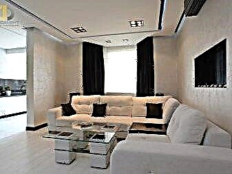

The living room and kitchen are the focus of household appliances, so the hi-tech style is ideal for interior design. A small area will visually increase, this will be facilitated by glass and metal surfaces that reflect light. Additionally, good lighting and built-in structures will help to increase the space.
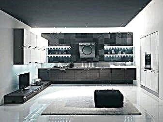
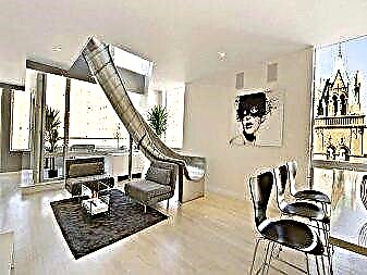
Separately, it is worth mentioning the partitions, which can be made of glass or plastic. They ideally fit into the space of the kitchen-living room and separate the dining room and the relaxation area.
What exactly you have to get rid of is a patterned bright carpet with a long pile. Any technique in the style of "retro" will also be inappropriate. It’s better to give preference smooth monophonic surfaces, without flashy prints. Such should be wallpaper or wall paint, built-in appliances, ceiling, cabinet furniture, all kinds of cabinets and drawers, tiles. All this will make the room bright, spacious, modern, dynamic, unique and even futuristic.
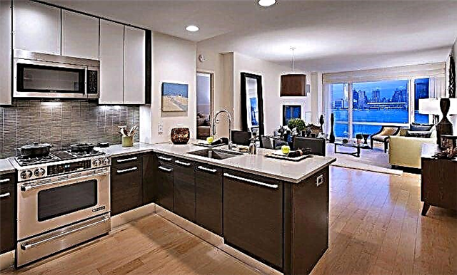
Interesting options for implementation
To divide the space in the kitchen-living room, you can use different flooring and a bar counter, which will stand in the middle of the room and border the sofa. The color incarnation of these elements should be combined and be close. In this case, the upholstery of the sofa is made of milk fabric with a delicate light beige print. The bar counter has a light pistachio hue, and the horizontal surface is made using white tiles.

In the part of the living room, dark brown parquet is used, which smoothly turns into a white-gray tile on the part of the kitchen. The dining table is combined in color with parquet, and the upholstery of chairs with high backs is tiled. White color can also be used for built-in cabinets and household appliances.
The integrated kitchen does not have to be the same color. In this interior, it is a key and bright detail, as it has a bright red tint.


For walls, you can use wallpapers of different colors. The main thing is that they are combined with each other and with the upholstery of furniture. The texture should also be uniform. A large wooden shelf of an unusual geometric shape in dark brown will organically fit and complement the interior design. Small luminaires can be placed in rows on the half of the ceiling, plus you can optionally integrate several in the dining area.

 For a hi-tech style room, it is important to choose smooth surfaces: the kitchen is usually equipped with a glossy set, which is most reminiscent of modern equipment facades - with glass and metal elements.