In the perception of the interior, color is crucial. Thanks to the successful color scheme, it is possible to create an atmosphere of coziness, warmth and tranquility in a living room. The design of the living room should definitely avoid the abundance of bright contrasting colors - it is difficult to stay in such interiors for a long time. In this case, the colors should not be too pale, so that the decor of the room does not turn out boring. It is important to choose the right base colors and dilute them with slight accents. To make it stylish and beautiful, the desired color scheme of the living room needs to be thought out in advance.

Features
In order for the colors to fit harmoniously into your room, it is very important to consider the features of the layout of the hall, the placement of furniture and the desired style in the interior. Color schemes in the design of the living room should not be random. Usually, 1-3 options are chosen as the base colors. However, they can look very different depending on which accents to emphasize.
It is important to keep in mind the size of the room you are decorating. If you have a very small living room, designers are advised to furnish it in bright colors - milk, beige, pink, yellow, soft blue and other pastel colors are suitable. This will visually expand the room, make the room more spacious and bright. If you have a large room, then pale colors, on the contrary, should be chosen with caution: such an interior can be boring and faceless, so it’s better to afford more saturated colors in the decoration. If you want light walls, try to diversify the color scheme with furniture and accessories.

Try to avoid pure colors in the interior - white, black, scarlet, bright blue or green. Instead, you should give preference to more complex composite shades. For example, interiors in beige, warm gray, brick, turquoise and olive colors are now in fashion. Composite shades themselves will make the atmosphere more interesting and sophisticated. Pure bright colors in the living room are possible only in the form of small accents.
If you do wall decoration in two or three colors, think about how they will be combined with furniture. If you want to highlight a light piece of furniture, put it against a dark wall, and if you want to emphasize dark furniture, place it on a light background. Sometimes in the interior it makes sense to make the furniture as inconspicuous as possible - a cabinet against the background of a wall in tone to tone can look very interesting.
Thinking over a color palette, consider features of that style in an interior which you have chosen. If you decide to decorate a living room in a country style, the most natural shades are best. If you chose a classic or a Provencal style, consider pastel colors. For hi-tech style and eclecticism dark shades can come in interesting combinations.
Color schemes
Color schemes in the living room can be very diverse. Combinations of the most unpredictable shades are now in fashion. So, the hall in brown tones can be varied with lilac, mint or red spots, and the blue walls can be perfectly combined with beige furniture. Emerald shades of green, fuchsia, pistachio shades, cool shades of pink, beige and rich purple are also in fashion. For a successful interior, it is important to decide which shades will be basic and which should be left for small details.

Designers do not recommend combining too many different colors in the decoration of one room. In a small living room, one or two shades for the walls will be enough, in the spacious room you can add a third color. If you are not sure how to choose shades, you can use the tables of ready-made harmonious combinations, but there is a risk that they will not exactly reflect the color of your paint or wallpaper. Therefore, it is better to take samplers in the store and combine them with each other - so you will be able to choose the best option from your own experience, gradually narrowing the circle of suitable colors.

Burgundy and lilac walls will look good in the interior, if these shades are quite dark. To further highlight these beautiful colors, you can combine them with beige, muted green or dark brown. This is a fairly traditional, but original and interesting solution for a medium-sized living room.
For a contemporary style, the black room will be the best solution., however, this idea can be realized only in a spacious and bright room. In this case, you need to choose interesting color combinations so that the black tone looks interesting. A gold or copper shade may come - the metallic color is now at the peak of popularity. It is also interesting to refresh the interior with a blue or purple color scheme in combination with black. Sometimes the black color of the walls and the laminate is combined with artificial brick or unusual ceramic tiles.
A cheerful yellow color is also in fashion now, but it should not be too bright in the interior. You should choose either a pale yellow color or a mustard shade for the living room. To highlight this color, it is recommended to combine it with cold gray, lilac or dark blue.
The living room in olive tones is a great option for art nouveau and eclecticism. You can diversify such an interior in orange, turquoise or ivory. In such an interior, textile wallpapers or painting walls with texture will look especially good.
Bright accents
Accents in the interior are of great importance. Even a boring and faceless interior can be decorated with correctly selected parts and accessories. In small rooms there should be a little emphasis and they should be large enough and plain so as not to split the space. If you have a spacious living room, you can afford a lot of interesting small home decoration.
A bright purple accent can refresh the pale interior in warm colors. It will be perfectly combined with various shades of ocher, yellow and brown colors. In this case, you can not combine lilac with bright orange. Also, do not make the emphasis large if the shade of lilac is saturated. A vase, planter, pillow or small floor mat is suitable.
The color of the sea wave will look great in any apartment. Particularly well, it sets off dark interiors in contrast. If you have dark brown furniture or black walls, a similar accent is necessary in the decor of your living room. This can be either a small subtle accent, or a rather significant detail. Of the little things, a bright photo frame, decorative dishes or a clock will do. If you want a more powerful accent, pick up a medium-sized carpet or curtains in the color of sea wave.
If you chose olive shades for the walls, you can consider peach accessories as bright accents. Textiles, such as rugs and pillows on the couch, will look very organic. You can also purchase or make your own baskets and boxes for storing things on open shelves - they can also work great.
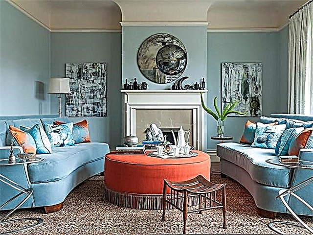
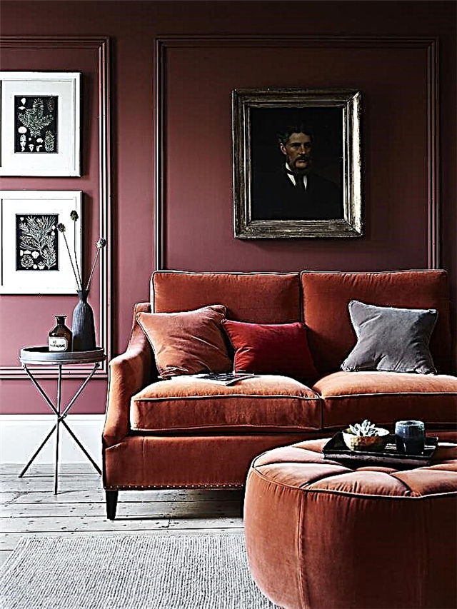
Rich burgundy tones - this is ideal for bright interiors in the Provencal style or in the country style. In a small living room, you should choose burgundy curtains, small pieces of furniture or a carpet. If you have a spacious living room in beige, light blue or milky tones, you can arrange smaller accents in the interior - look for a burgundy floor lamp, a vase, a flower stand or a picturesque picture in a similar color scheme.
Fashionable light green accents will best fit into the atmosphere of the hall in chocolate tones. Light and cheerful green shades will emphasize the depth of a warm brown shade and create an unusual cozy interior. The green shade is most often used in the interior only in small details - large objects in this color can look too defiant and intrusive. You should choose a stylish flower pot, massive photo album, plaid or pillows.
Practical tips
It is not necessary to combine contrasting colors in the interior - usually such combinations look too deliberately and defiantly. Red with green or orange with purple will look bad if they border each other in the interior. Nevertheless, you can choose small accents of such colors and arrange them in different angles - such a variety of colors will only enrich your interior.
Colors that are close to contrast look good togetherbut not such. For example, a combination of green with raspberry, red with khaki, violet with ocher, orange with lilac may look excellent. These are unusual and stylish combinations that attract attention and make the interior complex, diverse and sophisticated.
Choosing the right colors for the living room interior is not an easy task. It is important to consider many factors - the combination of colors with each other, the allocation of various interior items using color, the practicality of different solutions.

If you are not sure which colors are best combined in your case, you can simply take similar shades. Milk color looks great with beige, terracotta is suitable for brown, grassy green can be combined with khaki. These are classic combinations that will always look harmonious and do not require a carefully designed design. At the same time, there is a risk that in such close shades the room will look boring. In this case it is very important to think over bright accents.
If you don’t know which bright accents will be appropriate in your interior, There are several universal options that perfectly fit into the decor of any living room.. First of all, these are metal things - products stylized as silver, bronze or gold that look really bright and fit absolutely any color scheme. You can also use stained glass - a variety of translucent shades will emphasize any interior. Finally, bright white accents will look great in almost any interior, with the exception of rooms with a very bright plain finish.
Beautiful examples in the interior
Eclecticism allows for many different examples of color combinations. If they look organically and you feel comfortable in the interior, then the colors are chosen correctly. Very often, in eclectic interiors, people try to place accents in a variety of colors, so that the atmosphere is as saturated, varied and distinctive as possible. But this is not necessary. An eclectic design can manifest itself in the shape and material of objects, while colors can be quite restrained.
The choice of a suitable color palette will directly depend on the style in which you want to design your interior. It is important that the color scheme harmoniously fit into the overall design concept of your living room.

If you have a country style interior, you should use mostly natural colors. First of all, do not be afraid to combine different shades of wood with each other - such solutions will look very good. The interior can be varied in ivory, terracotta, golden yellow or khaki.
Classic interiors are always in fashion. There is a stereotype that in such interiors the walls and furniture should remain white, but this is not always the case. Moreover, the pure white color creates a feeling of incompleteness, such a room is unlikely to look habitable and cozy. It is better to use milky shades in decoration, white-gray or beige. Other pastel colors can be used moderately, and it will also be nice to add a few accents that should be selected in dark colors.
You can find out how to correctly combine colors in the interior in the next video.
Lost on white spaces
White walls are a trend that has come along with fashion for minimalism and Scandinavian style. White is a universal color, it expands any room, adding light and air to it. Carried away by this color, you can easily find yourself in a lifeless interior that requires constant cleaning. Do not abuse: either a white background or white accents. Colored details, furniture, accessories, natural textures will dilute the void and fill it with life.
Consider a beige background to be a good one.
Uncertain people subconsciously seek a compromise when choosing a color. Hence the popularity of “beige”: light (but not white), warm and discreet. The color, which seems universal, makes the interior dull, devoid of character, giving away an office and a hotel. It is difficult to design a stylish interior in beige, you will need to choose bright - red, yellow, blue - accents for a specific shade and depth of beige. Tip: the more modest the palette, the more rich and varied the textures should be.
Confused "white" with white
Snow-white interiors look cold even with bright details. And if there isn’t enough sun, then it’s also gray - not at all like in the picture in the magazine. In interior design, “white” means about a dozen shades: “cream”, “baked milk”, “ivory”, “Arctic snow”, etc. They are distinguished by impurities of other colors. For example, in a traditional Scandinavian interior, the walls are painted not in boiling white, but in “Stockholm white” (Stockholmsvit), where a little gray and yellow pigment is mixed. The result is a warmer shade.
Believe that ceiling and white are synonyms
If you paint the ceiling in one color with the walls, you can visually expand the room, as the boundaries of space dissolve. In the case of dark tones, this technique will create the feeling of a cozy box. This technique requires caution only with bright colors: a confined space greatly affects the psyche. You can even paint the ceiling in a contrasting or bright color with neutral walls, especially if you got a room with disproportionately high ceilings.
Create an interior in different shades of the same color
By betting on monochrome, you are depriving the space of volume, depth and pleasant complexity. The exception is the magical gray color, but that one is not for everybody. Try to keep the variety. Set contrasting accents. Play in the midtones of your favorite color: combine a strongly whitened pastel shade with a rich dark or expressive bright.
Act on the principle of “all equally”
The opposite mistake is to choose good color combinations and saturate the space with them equally. As a result, motleyness instead of harmony. Stick to a percentage of 60/30/10 for the main color, complementary and others.
Use one contrasting thing
If you purchased a beautiful bright red sofa against the pale blue walls, add a few small orange accessories to the rest of the room, otherwise the sofa will fall out of context, it will look alien and inappropriate. This is called "maintain color." It is better to break the color spot itself with small details of other colors, primary or secondary: this way it fits better into the situation.
Use pure colors in contrasts
Using contrasting combinations is a win-win option. Red will always look expressively with green, yellow with purple, and blue with orange. But the contrast itself is such an expressive device that it can easily tire. Let one of the colors be more saturated than the second, bleached or darkened.This will soften the effect and help to avoid obsession.
Ignore lighting
The same apartment in Valencia and Murmansk will need completely different color schemes. The northern lovers of Provence suffer most from this injustice. Soft pastel colors, so gentle and refreshing in bright sunlight, without it become faded, cold and boring. There is only one rule: the more cloudy the region, the warmer and richer the colors in the interior.
Theoretical aspects of color combination
Each designer knows the basics of color interaction, and if you decide to design an apartment on your own, then you should also figure it out.
There are aromatic colors, these include white, black, gray and chromatic. The chromatic circle is a diagram that consists of the primary colors: red, blue, and yellow. By mixing primary colors, secondary tones are obtained.
The main shade and those that are formed from it are called related, they have four groups: yellow-green, yellow-red, blue-red and blue-green. They are in good harmony with each other, as they consist of an admixture of the same primary colors.
 Pastel cold shades.
In adjacent quarters are related-contrasting shades, their combinations allow you to get the richest range. If you combine colors located through one sector, then they usually cause discomfort. Opposite to each other in quarters of the color wheel are contrasting colors. Their combination is used when you need to draw attention to a specific place in the interior.
What colors are combined in the interior?
I described the basic rules for using color in creating the interior in the first part of this article: I recommend starting with it in order to at least understand the terms. Now let's talk about the types of color harmonies - useful schemes for choosing complementary colors.
It is important to say here that any colors can be combined with each other in one space, but the greater the discrepancy with standard schemes, the more efforts will have to be made to achieve harmony. The same pattern can look completely different depending on the choice of shades and the amount of color, so why complicate your life?
Monochrome harmony
The easiest approach is to choose one color and use it to the fullest. Of course, in different shades (mixed with white, black or gray) and in combination with achromatic colors. Note that if you have white walls and a ceiling, a light wood floor and, for example, a blue sofa, this is no longer a monochrome harmony. A light tree is a whitened yellow or yellow-orange color. But if the sofa is brown, obtained by dimming yellow, the room will just be monochrome.

This harmony has a high risk of being boring, therefore it is used mainly in hallways and corridors or small rooms such as a toilet, bathroom, laundry. It can also be found in very minimalistic interiors. However, if you use a lot of shades, it can be quite interesting.


Polar harmony
This harmony is made up of two colors opposite each other on the color wheel. These colors are also called contrasting. It is believed that the combination of contrasting colors is perceived by our eyes in the best way, we find it very harmonious. However, applying this harmony is important according to certain rules. Of the two colors, one should dominate, it can be used in a wide range of shades - from the lightest to almost black, including the brightest and purest color. The second color will be optional: take a limited range (light or dark shades) and apply them in dosage.

what colors are combined with each other in the interior
There is an important rule here: be sure to use shades of a mixture of colors to build a connection between them. For example, in the polar harmony of blue and orange, mix these colors in different proportions. When mixed, for example, in a ratio of 1 to 1, you get a dark brown color, which you would not have achieved by simply dimming the orange.
In all the photos below, the polar harmony of blue and orange.


Harmony of Close Colors (Related)
For family harmony, 4 colors are selected that are next to each other on the color wheel. The exception is only a segment from yellow to red-violet, here it is permissible to take all these 5 colors. Give each of your intimate colors your role: one will be dominant, the other secondary, and the other two complementary.

As in polar harmony, the dominant color can be used in the full spectrum from light to dark, secondary - excluding bright and pure shades and significantly less in quantity, and additional ones are very limited. For example, in the harmony indicated below, for example, yellow can dominate, green can be secondary. Then, for example, we see yellow-green as very light green, and yellow-orange as dark brown.


Classical Triad
The triad is the most complex color scheme, but also the most often used: such interiors turn out to be balanced and interesting to perceive. For the triad, three colors are taken, located equidistant from each other on the color wheel, as if at the corners of an equilateral triangle. The same approach: colors line up in importance, one always dominates, the rest are used to a limited extent.

As for mixing colors among themselves, this is an important point in the triad, but there are two approaches:
Option 1. Use shades of a mixture of dominant and secondary and shades of a mixture of dominant and third-rate, but do not mix additional colors themselves.
Option 2 Mix additional colors into one color and already mix it with the dominant one. This mixed color can be brightened and darkened, diluted with gray, as well as primary and secondary colors.


You can choose color harmony without fuss with paints using this program.
Below we have collected examples of how colors can be combined with each other. It doesn’t matter what shade your favorite in the interior - yellow, green, orange, purple - for any room you can choose the right combination.
Green combined other colors


We make decades-long repairs and choose colors carefully. Therefore, more often you will find light, neutral interiors, where brown or gray is added to beige. But do not immediately say that this boring three. They are universal. And putting one spectacular color in pair with them, you will get a bright interior and you won’t be depressed when nine months of bad weather are outside.
The combination of gray in the interior
It is considered a neutral color and means prudence. What feelings does he evoke in you? “Gloomy and dreary,” you say. Not at all. A thundercloud, river mother of pearl, morning harbor or wet stone are just a few shades that have come to mind. Many designers and decorators consider gray to be a more graceful brother of white. It fits into any style and its undoubted dignity in many shades. Selecting a shade of gray is not easy, but it will suit both the living room and the kitchen or bedroom, and is combined with a large number of colors and decoration materials.
What to combine with?
Gray and yellow. At first glance, different and conflicting colors, but they get along well. If gray make the main background in the room, adding yellow accents. Yellow will highlight gray, and gray will balance yellow, not allowing it to overload the interior.
The combination of beige in the interior
It is also neutral and belongs to the brown range. It expresses calm, craving for comfort and is always associated with classics.
What to combine with?
Beige and red. As in the previous pair, one color (red) will play an active and assertive role, and beige will be a calm and restrained background. Together they will create a welcoming and cozy atmosphere.
The combination of brown in the interior
This is tradition and conservatism. Brown is associated with confidence, nature, reliability, durability and will make space noble. For example, chocolate shades contribute to psychological balance and calm. But brown visually reduces the area, so add white, milky and beige colors to it.
What to combine with?
Brown and lavender. Light lavender color will be well emphasized by warm brown shades. The main trick is to choose a not too active and bright lavender tone.
The combination of colors in the interior of the living room
We add the living room like a puzzle to various parts: sofas and armchairs, coffee tables and lamps. But where to start if you don’t know where to start? Start with the couch. In addition to the bed and table in the kitchen - this is the most used thing in the house. And here gray is by the way. Stylist and designer Emily Henderson in her book Style. Thousands of tricks and tricks for decorating any interior ”(take note of this book, you will not regret it) advises you to choose a gray sofa in a simple and convenient form if you are confused about“ which one to take ”. And by rearranging or moving things a bit, you get a completely new room.
Tip. Also note the gray wooden furniture. The calm gray shade of the cabinets will hide them, if the walls will match them. Traditionally, we choose a white ceiling, but gray in the living room will not reduce it at all, but it will seem higher, as if leaving for the sky.
The combination of colors in the interior of the kitchen
The art of hosting guests is to make them feel at home. Gray is the perfect color for both small and large for the kitchen. It can be both warm and cold, thanks to many shades it can become both a background and a rich accent.
Tip. If you paint the walls in gray, then choose warm colors for the floor and furniture. It is better to avoid beige, more precisely a beige-yellow shade. If there is little light and a small meter in the kitchen, the color will appear dirty and create the impression of stuffiness. Take a closer look at shades close to yellow.
A noble brown tint is usually used in kitchen furniture. The undoubted advantage is that the kitchen will not go out of fashion for a long time, but keep in mind: massive dark cabinets will reduce space, so make walls in bright colors. And if you chose brown for the walls, then the opposite rule - furniture, textiles and household appliances is best done in light shades.
The combination of colors in the interior of the bedroom
The place where we spend the most time at home and ironically do not see it most of all, because we sleep. But still, the colors should create a cozy and comfortable atmosphere. The easiest and safest option is light beige or brown gamma. But still look at the gray.
Gray, like black, is suitable for almost all colors: blue, blue, green, yellow, brown, pink. Such bright accents will look great in a gray frame.
Tip. The gray color of the walls or textiles will appease no less than the classic white or beige combinations.
But no matter what color you choose, there is not some very harmonious and correct combination in the interior. As there is no law where forbidden or permitted colors would be painted. Of course, you can use the Luscher method or the “seasonal” approach (there is one) for choosing colors, but only your internal craving or rejection of a certain shade will help to make your own, most harmonious palette.
Quartblog Digest
Bright walls: examples from real Russian apartments - Let's show Russian apartments, the owners of which were not afraid of experimenting with color and did not lose.
Yellow in Moscow apartments: the best examples - Yellow is cheerful and positive. Not surprisingly, many Muscovites choose it for their apartments: after all, the sun is never superfluous!
Turquoise color in Moscow apartments: the best examples - The beauty of the turquoise color on examples from real Moscow apartments.
Hold red warm and blue cool
Common errors are also associated with an incorrect assessment of the warmth of color. Red, yellow and orange shades certainly belong to the warm part of the spectrum, and blue, violet and green are considered cold. Everything is more complicated. Each color has warm and cold versions. Red with an admixture of purple is blackberry, berry, magenta is colder, and close to orange tones it is scarlet, cinnabar is much warmer. It is the same with traditionally cold blue: turquoise and the color of the sea wave is warmer than celestial and steel shades. Green is generally a multifaceted color, easily turning into both warm and cold shades.
Mix warm and cold shades of the same color
More precisely, this can be done, but difficult: you need to take into account the proportions, combinations of each shade with other colors. In most cases, disharmony is obtained. If there is any doubt that a thing falls into the desired color temperature, it is better not to risk it and choose a contrast or neutral color. This solution will definitely be more successful than, for example, grass-green against the background of cold mint shades.
Overuse pure colors
The cleaner the color, the more intrusive it is. Voiced bright colors are good in the nursery, in the kitchen and in the bathroom - and even in a reasonable dosage. In other cases, it is better to prefer complex mixed colors with the addition of black or gray (darkened, dusted) and white (bleached, pastel). Such an interior looks nobler and more mature. Pure bright color, as a rule, requires a neutral background and strict minimalist decor.
Table color combinations in the interior, depending on the type of room
Since color affects the psycho-emotional state of a person and biochemical processes in the body, in rooms with different purposes, the combination of colors in the design of the interior will be different.
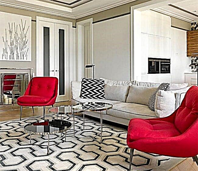
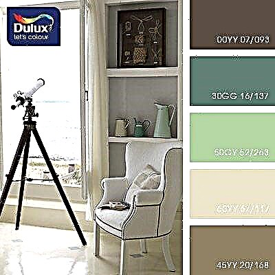
 Living room interior
Particular care should be taken when choosing a palette when decorating rooms such as a bedroom and a children's room, as they are designed for relaxation. With improper design, a person will not be able to rest normally both physically and psychologically. The following is a table of color combinations in the interior, compiled by our designers.
| Name of the room | Recommended color combination palette |
|---|---|
| Kitchen | Soft and calm tones: yellow turquoise. |
| Hallway | Tones that enhance mood and digestion of food: green, beige, yellow, silver, as well as their combination with red and blue. |
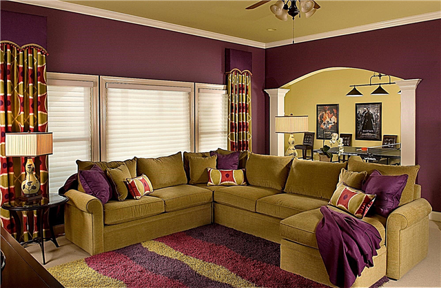
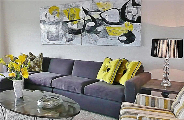
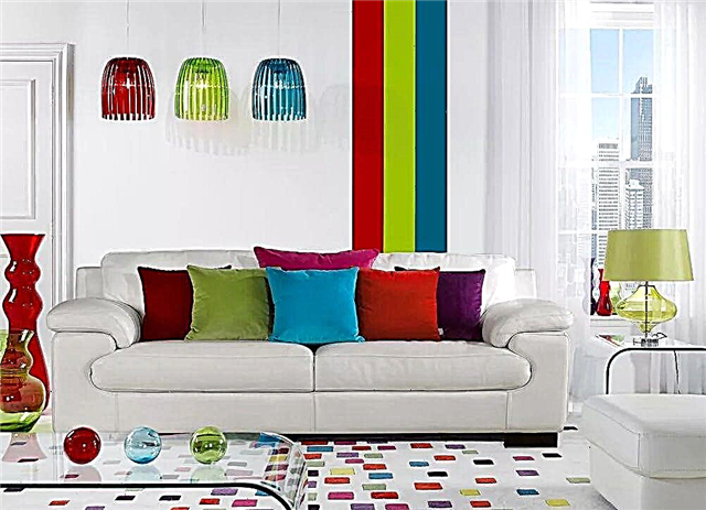
| The combination of colors in the interior of the living room | Neutral, soft tones that are diluted with bright accents. |
| The combination of colors in the interior of the bedroom | Pastel colors and shades of purple. Keep in mind that the bedroom is a private space, so there are no restrictions, and it is designed at the request of the owners. |
| Bathroom | Light tones with a bluish tint, as they give a feeling of freshness and purity. |
What is a color wheel, by what principle is the palette of color combinations in the interior built
Professional designers know how to choose the right color combination palette in the interior, so their work looks attractive and harmonious. To do this, they use a tool called a color wheel. What is it?
It is called the conditional representation of the visible spectrum of sunlight, which indicate various color options. Over the years, different theories have appeared, so there are several circles:
- RGB:
- RYB.
 Color circle
In the sectors of the circle, the shades are placed in almost the same order as in the spectrum of visible light, and for a bunch of extreme tones, the conditional magenta shade is additionally used
To better understand the correct compatibility, you need to build a color wheel.A person is distinguished by three main tones: yellow, red and blue. All others get when mixing the main among themselves, and also the main and derived shades. By mixing the primary colors, they obtain the composite, and the remaining empty cells are filled with tones of the third order.
A little more theory about the combination of colors in the interior - a photo of a table of cold, warm and neutral shades
Everything that surrounds us has its own color, and each tone has a certain effect on the body. The color wheel has several parameters and according to one of them it is divided into cold, warm and neutral. Next, let's talk about the combination of colors in the interior, photo tables with shades attached.
 Separation into warm and cold
Warm colors
Most often, the circle is divided in half, all shades of yellow are perceived by us as warm. They subconsciously arouse a person's feeling of warmth, coziness and comfort, therefore they allow you to create a pleasant and welcoming atmosphere in the room. We associate such tones with summer. Typically, these are:
- yellow,
- Orange,
- red,
- purple.
 Warm colors
Cool colors
All shades that are close to blue are considered cold. They are associated with winter, help to create a feeling of coolness and freshness in the room, seem clean and distant.
 Cool colors
Neutral colors
Shades that do not cause a person to feel warm or cool are called neutral. If they are located next to warm or cold shades, then smooth out their effect and make the color softer.
 Neutral colors
All this classification is conditional, pure colors can be found only in the picture, in nature they smoothly pass one into another, therefore it can be red in both warm and cold colors.
Color combinations in the interior - layouts for different styles
When creating a specific design, you need to take into account not only your wishes, but also know and follow certain rules. Only in this way will you be able to properly arrange your premises and prevent serious and gross errors.
Before exploring layouts for color combinations in the interior, we recommend that you pay attention to the main points of the correct design:
- base selection
- the right combination of warm and cold tones,
- warm colors are used to create coziness in a large room,
- in a small room, it is better to use cold tones, this will visually increase the room,
- when designing a kitchen or dining room, keep in mind that shades can both enhance and depress appetite,
- in the bedroom, the color palette of the combination of colors in the interior should provide a comfortable rest,
- for each style of interior, experts recommend using certain tones,
 Combination Layouts
Each style has its own color scheme for combining colors in the interior. The table below discloses all recommended shades for room decoration.
| Style name | Recommended Shades |
|---|---|
| Classical | Different tones, but must be white. |
| Provence | Blue, pink, light milky. |
| Eco Style | Brown and off green. |
| High tech | White, black and metal color. |
| Baroque | Any pastel colors. |
| Modern | Green, blue, brown-beige. |
| Minimalism | White black. |
| Pin up | Yellow, pink. |
| Loft | Green, red, orange, blue. |
| Country | Light yellow, brown, sand. |
| Futurism | Light green, white, ultramarine, lemon yellow. |
Complex combination
This option is considered universal. Classic shades are used, they include beige, gray and white. Combining these tones with others, you can create a classic solution that will always look modern and beautiful. In this case, you will not need to constantly change the interior of the room when buying new furniture, replacing floor coverings or other elements.
 Complex combination
Triad or combination of 3 colors
The use of three primary colors, which are always harmoniously combined with each other and can be used in equal measures. The combination of red, blue and yellow causes a surge of emotions and vivacity. If they are used in their pure form, then a bright and rich solution is obtained. If halftones are used, then the design of the room is less aggressive and more comfortable.
 Shade triad
Using a triad helps to fill the room with energy, so this solution is used to design the living room, sports facilities and children's rooms, and this design is not recommended in the kitchen or bedroom.
Similar combination
This option involves the use of 2-3 types of shades, which are located next to each other in the color wheel. You need to choose the appropriate one in which you decided to design a room and select several tones in the color wheel to the right or left of it. This solution is simple and original, and picking up two or three similar colors is easy.
 Similar combination
Separately complementary combination
With a complementary combination, contrasting shades are used, on the color wheel they are located opposite each other. In a separately complementary solution, instead of the color opposite, choose a shade that is next to it. This allows you to create contrasting solutions, but they do not turn out as intense as with a complementary combination.
 Separately complementary combination
Tetrad or a combination of 4 colors
In this case, the scheme consists of the main color and there are two more that complement it, and the fourth serves to highlight the accent. This creates a rather interesting effect that causes positive emotions. Basically, such colors are preferred by young people or people who are in constant motion and fast rhythm.
 Notebook in the interior
The magic of color or the gradient effect in the interior
The gradient in the interior is a modern solution used to decorate different living spaces. It is based on a smooth transition from dark to light tone. This method can be used in the design of various interior details.
The gradient effect helps bring freshness and excitement to the room. Typically, designers use different shades of blue, since it is he who gives a beautiful combination of colors in the interior.
 Gradient effect
Experts recommend making the transition so that a darker tone is on the floor, and lighter on the ceiling, this will visually increase the room.
We select a combination of shades for different places in the room - a table with recommendations
To create a comfortable and cozy space in a room, it is important to choose the right color solutions when decorating the ceiling, floor and walls. With the help of competent combination, you can even breathe light and air into a small room, and make a large room more warm and comfortable. Further in the article is another table of color combinations in the interior, which will help you choose the design of different places in the room.
| Floor, wall and ceiling design options | Recommended Solutions |
|---|---|
| Contrast combination | The walls make bright colors, the floor is dark and the ceiling is light. You can visually resize the room, hide existing flaws and highlight the benefits. |
| Current gradient | The ceiling is light, the walls are slightly darker and the floor is dark. The transition from dark to light tones allows you to create harmony, this design is suitable for any room. |
| Light and air | The walls and ceiling are light, the floor is dark. Suitable for a small room with low ceilings. |
| Opposites | The ceiling is light, the walls are dark, the floor is light and vice versa. This option can be used in rooms with low and high ceilings. |
The psychology of color, or how does it affect us?
Studies have shown that color affects a person’s mood through his subconscious. Perception is influenced by factors such as health status, age, social status of a person and his character.
 Colors and colors
On women
Women are more sensitive to the perception of color and shades. There is no clear distinction between “male” and “female” colors, as each person is individual. Despite this, there are tones that women prefer more:
- blue, it has a calming effect and is loved by both women and men,
- green, associated with nature and the feminine, symbolizes health and tranquility,
- turquoise, this shade is one of the most beloved among women,
- purple - he is a representative of the “female” color, emphasizes the mystery and mystery of the woman,
- pink tones are associated with women, but this is more likely not a preference, but a pleasant rule,
- the lilac color is also considered “feminine”; it evokes a feeling of romanticism and nostalgia.
 Women and interior colors
With age, color preferences change, women like pink more, and green prefer less than in youth.
On men
It has been established that men perceive approximately 30% fewer shades compared to women. Often women are outraged that men cannot appreciate their efforts in choosing a color, but this is due to physiology, since for them pumpkin and peach colors may not differ from each other.
 Perception of color by men
Most men prefer blue and its different shades. Some scientists believe that they symbolize it with clear water and a clear sky. In addition to blue, men love green, but unlike women, they prefer colder tones. Traditionally, they love black, and purple and pink, most men can not stand.
On children
Newborn babies see everything in black and white and only after 2 months begin to distinguish between other colors. At the age of 2-5 years, they can already distinguish the entire visible spectrum.
Children are attracted by everything bright, so they like pink, red, yellow tones, such preferences last up to 10 years, after which the child may already like the blue tone and all its shades. Girls prefer pink, purple, while boys are more fond of blue and its shades.
The combination of colors in the interior: curtains and wallpapers, as well as furniture - how to combine?
In most cases, textiles are bought when the room has already been repaired and furniture is arranged. In this case, when choosing the right fabrics, there are many difficulties that affect the combination of colors in the interior. Curtains and wallpapers, as well as furniture are much easier to select at the same time.
 Good color combination
The order of color selection of furniture and textiles will be as follows:
- determine the first and second basic shades,
- Wallpaper is bought in a light shade of the first color,
- furniture in two different colors of the second option,
- curtains should be made of fabric with a pattern consisting of the first and second colors,
- the same fabric will be for decorative pillows,
- Pillows can be made of fabric saturated first color.
 Bright room
This is a conditional algorithm and each designer can develop his own, but if you are new to this business, then focus on the described technology and you will be able to properly design your own home design.
What colors will definitely not be combined?
There can be no definitive answer to this question. Modern fashion is extravagant and creative. If earlier the combination of green in the interior and red was considered tasteless, now this will not surprise anyone.
 Harmony and disharmony, or a combination of colors in the interior - a table.
When creating a classic interior, experts do not recommend combining cold and warm tones, but there may be small bright inclusions. If you want to combine contrasting colors, then do it better with halftones.
10 facts about the possibilities of color in the interior, which you definitely did not know about!
Consider 10 interesting facts about the influence of color during interior decoration:
- Features red. His women and men perceive differently, women distinguish the slightest tones, while men do not perceive many shades of red.
- The color of music. Scientists have found that fast and fun music in most people is associated with warm tones, while slow songs are perceived as cold. Thus, by changing the music in the room, you can change the perception of its interior.
 Color of music
 - Chromophobia It is a disease when a person is afraid of a certain color. He will be uncomfortable in a room decorated in an annoying tone, this must be taken into account when decorating the interior.
- Gray world. The color solution is obtained as a result of the work of the brain, which converts the information received from the eyes. The visual organs of a person see a spectrum of waves having different lengths, so the perception of color depends on the degree of illumination, texture, distance to the object, its temperature.
 Gray world
 - Color blindness. There are people who have a genetic feature that does not allow them to correctly distinguish shades. Most often they confuse green and red between themselves, if color blindness is congenital, and in the case of acquired pathology, they confuse yellow and blue.
- Blue is my favorite color. A survey among men and women showed that the most beloved is precisely blue and its shades.
- Pink has a calming effect. It reduces aggression and makes a person more friendly, therefore it is used in rehabilitation centers, correctional institutions.
 Pink color
 - Color improves palatability. It is best that the coffee set is brown in color and the cups for chocolate should be cream or orange. Yellow arouses appetite.
- The dispute over black and white. There are two opinions which of these colors does not exist. Artists claim that there is no white, and black is obtained by the combination of all colors. Scientists claim that white is the fusion of light waves of different lengths, and black is the absence of light.
 Black and white
 - The most unpleasant color. Scientists have found that the most unpleasant color is the one obtained by mixing the colors of swamp slurry and excrement, in the international classification it is designated Pantone 448C.
 Color of music
 Gray world
 Pink color
 Black and white
Brighten large areas
It is easy to overdo it and slide into the carnival: bright colors will soon begin to bore and will oblige you greatly in the future. It is more appropriate to choose softer muted shades for large objects and entire walls, and add saturated ones due to accessories, which can be easily replaced if desired. In non-residential areas (bathroom, hallway, hallway), color therapy can be used without fear. In these rooms you do not spend much time.

Be afraid of dark colors
It is gloomy, not for small rooms, it narrows the space - these are the main misconceptions associated with dark colors. Yes, they seem closer than light ones. But dark shades also envelop, give depth, nobility and comfort. A small room will not look cramped if you avoid contrasting solutions and do not clutter up the interior with details. Close space makes color turmoil and passion for decor.